Typefaces
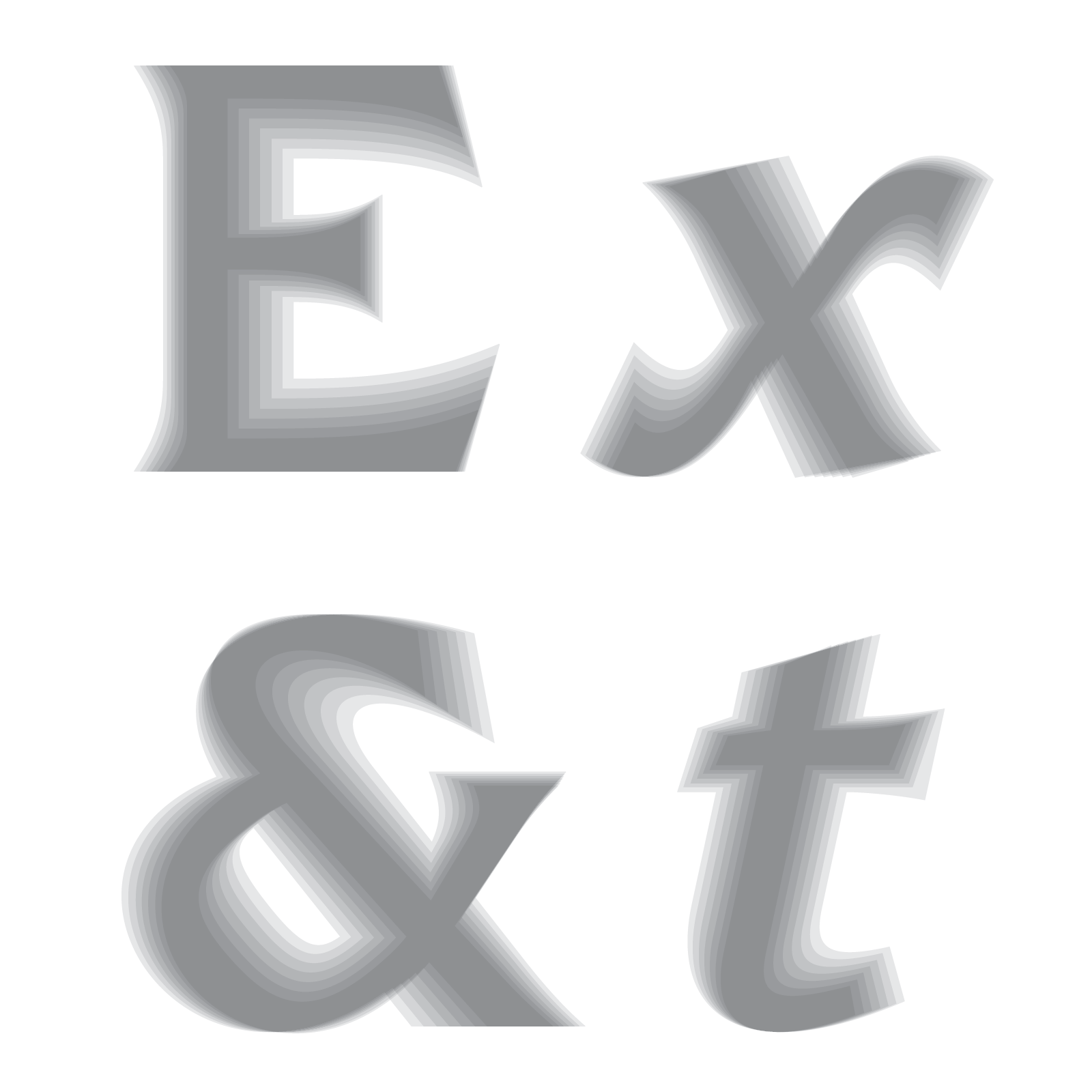
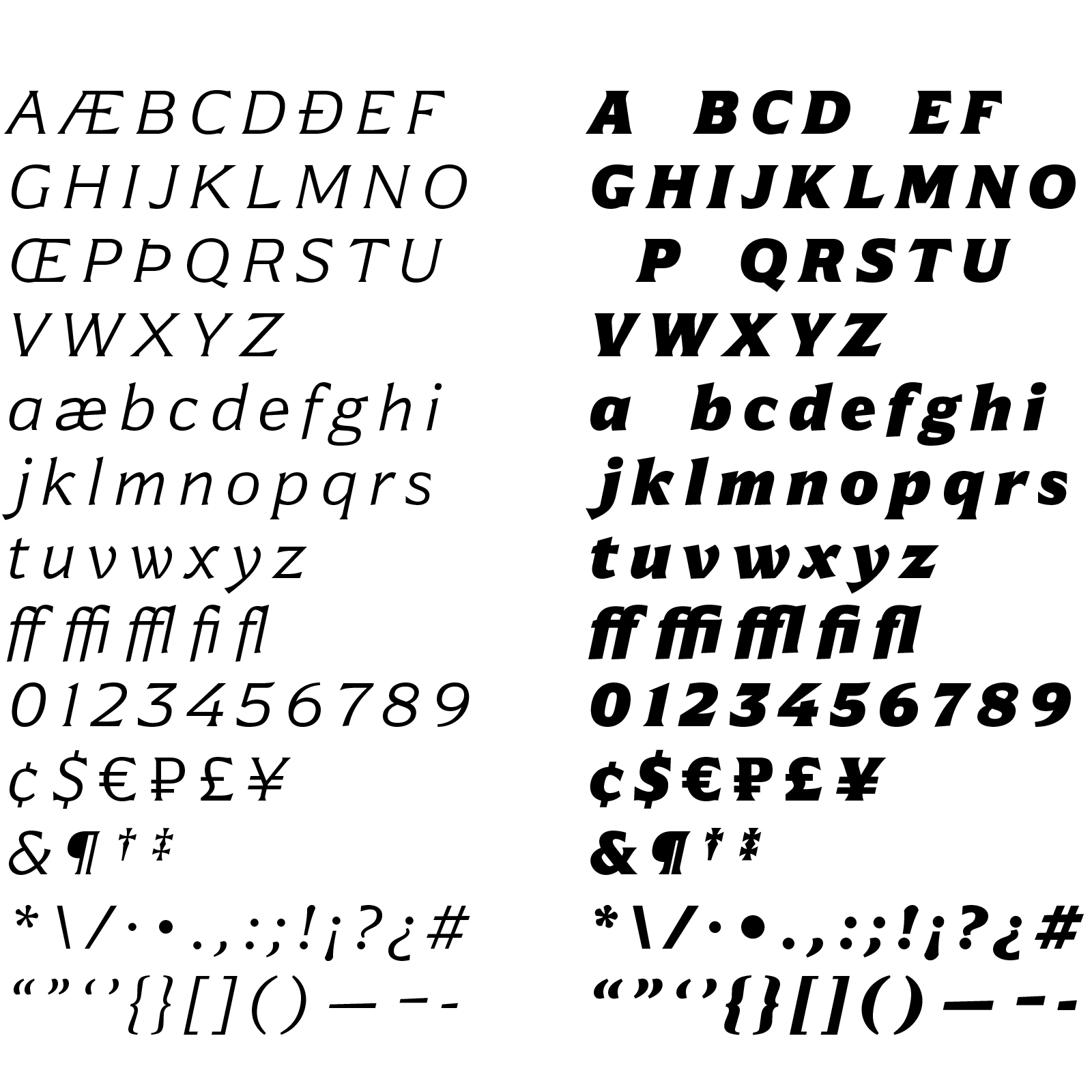
Not yet available for public release, Ember Latin is my latest type design project. By far my most extensive type family, Ember comprises of seven weights and italics. While most Latin style typefaces skew toward their humanist roots, I drew inspiration from 19th century Gothic and Grotesque typefaces. While designing I noted that Ember resembled some styles of chiseled letters carved in stone from the 18th and 19th centuries. They too were a step removed from the calligraphic influences of humanist fonts. Ember Latin brings this style back to printed page.
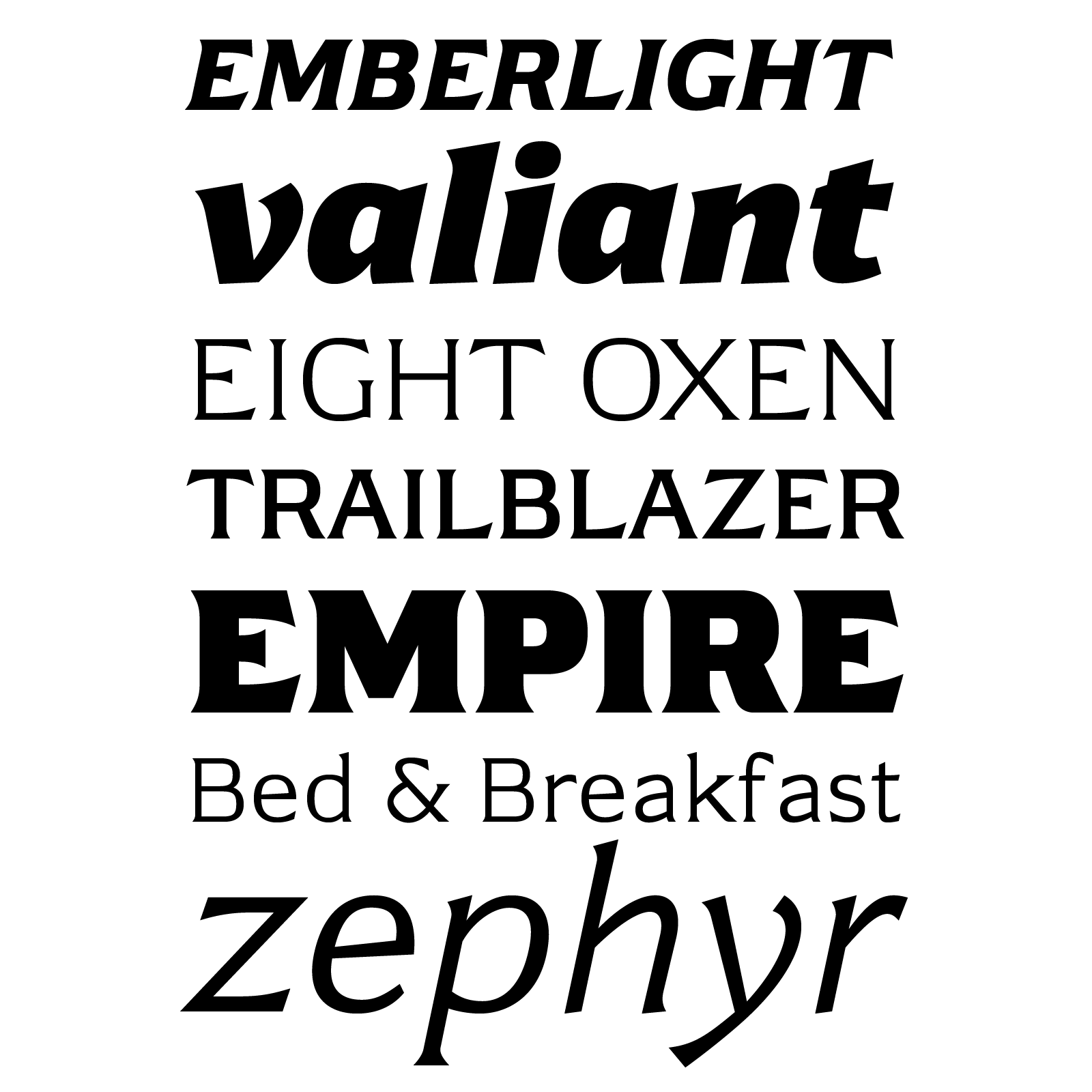
Seven weights, Light through Black. As the font weights get heavier, they become more expressive and dynamic.
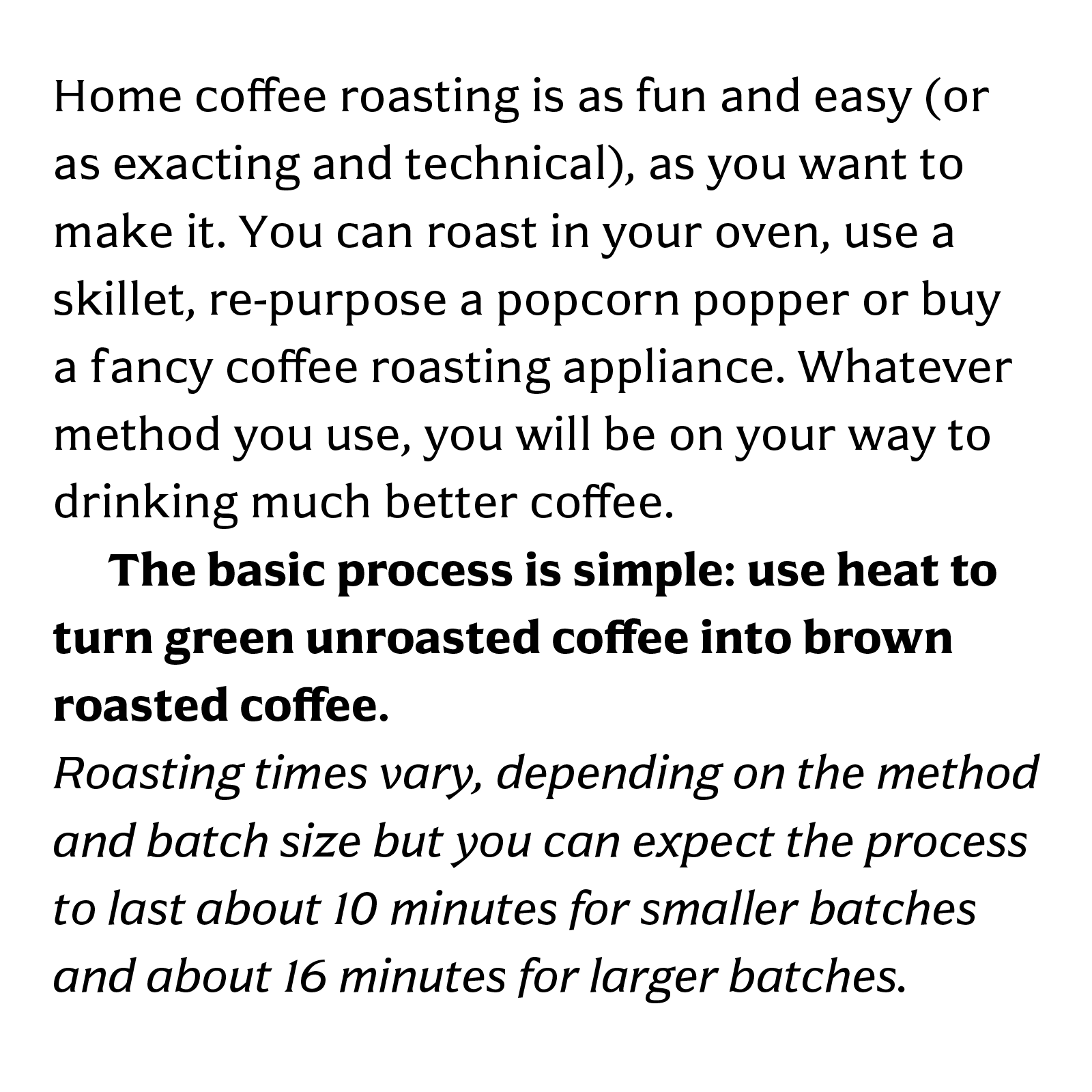
Ember is best used at display sizes or short amounts of text. A Text version is currently in the works.
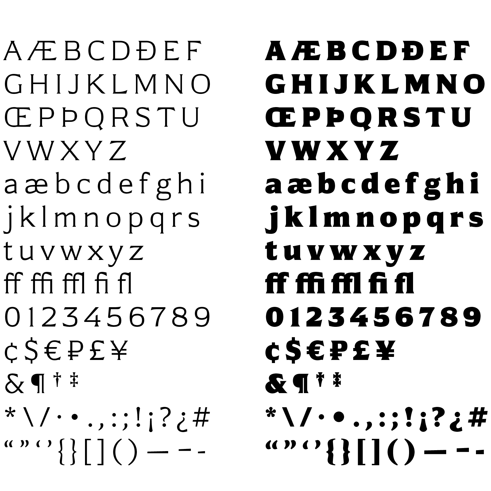
At release Ember Latin will support all western European languages and have a complete list of OpenType features.
Ember Latin is currently slated for release in 2020.